
复制安装命令
用 Codex 或 Claude 安装复制这段 Prompt,粘贴到 Codex、Claude 或其他助手里,让它先审查 Skill 页面再帮你安装。
复制前请先查看来源、License 和安全提示。
Open Design: The open-source Claude Design alternative
用 Codex 或 Claude 安装复制这段 Prompt,粘贴到 Codex、Claude 或其他助手里,让它先审查 Skill 页面再帮你安装。
复制前请先查看来源、License 和安全提示。
来源文件:README.md
⚡ Open Design Cloud — the official model service. One recharge to use GPT, Claude, Gemini, and DeepSeek inside Open Design: 20+ flagship models, zero config, billed by real token usage. Try Open Design Cloud
🏅 The Open Design Fellow program is now open. If you also believe design should be open — become an Open Design Fellow, shape the product alongside the core team, and help more people take part in defining the future of design. Details →
MAINTAINERS.mdand Discord.
Website · Download · Open Design Cloud · Discord · Follow @OpenDesignHQ




English · Español · Português · Deutsch · Français · 简体中文 · 繁體中文 · 한국어 · 日本語 · العربية · Русский · Українська · Türkçe · ภาษาไทย
🎨 The open-source Claude Design alternative. 🖥️ Local-first native desktop app for macOS and Windows. ⚡ Composable skills, brand-grade DESIGN.md design systems, and ready-to-use plugins. 🖼️ Generates web · desktop · mobile prototypes, live dashboards / artifacts, decks, images, video, plus HyperFrames motion graphics. 🔒 Sandboxed iframe preview · HTML / PDF / PPTX / MP4 export. 🤖 Runs on Claude Code · OpenClaw · Codex · Cursor · OpenCode · Qwen · Copilot · Amp · Hermes · Kimi · Antigravity and 25 distinct local CLI executables, or any OpenAI-compatible endpoint via BYOK.
Open Design is what you get when the agent-native loop Anthropic shipped with Claude Design — discover the brief, lock the direction, stream the artifact, critique, deliver — stops being closed and becomes a filesystem of functional skills, rendering design templates, design systems, and plugins that the coding agents already on your laptop can read, write, and remix. Your CLI becomes the design engine, your laptop becomes the studio, and your team's DESIGN.md becomes the brand contract.
It's also the Figma alternative for the agent era — instead of pushing pixels on a canvas, it delivers single-page artifacts in real CSS, real fonts, real components, exported straight to HTML / PDF / PPTX / MP4 — already shaped by your design system, already runnable inside the agent you use every day.
A quick look at what Open Design is and what it does. Start from Home, orchestrate repeat workflows with Automation, distill a brand contract in Design System, and extend with Plugins and integrations; inside any project's Studio, the same design system streams out prototypes, live artifacts, HyperFrames, decks, and images.
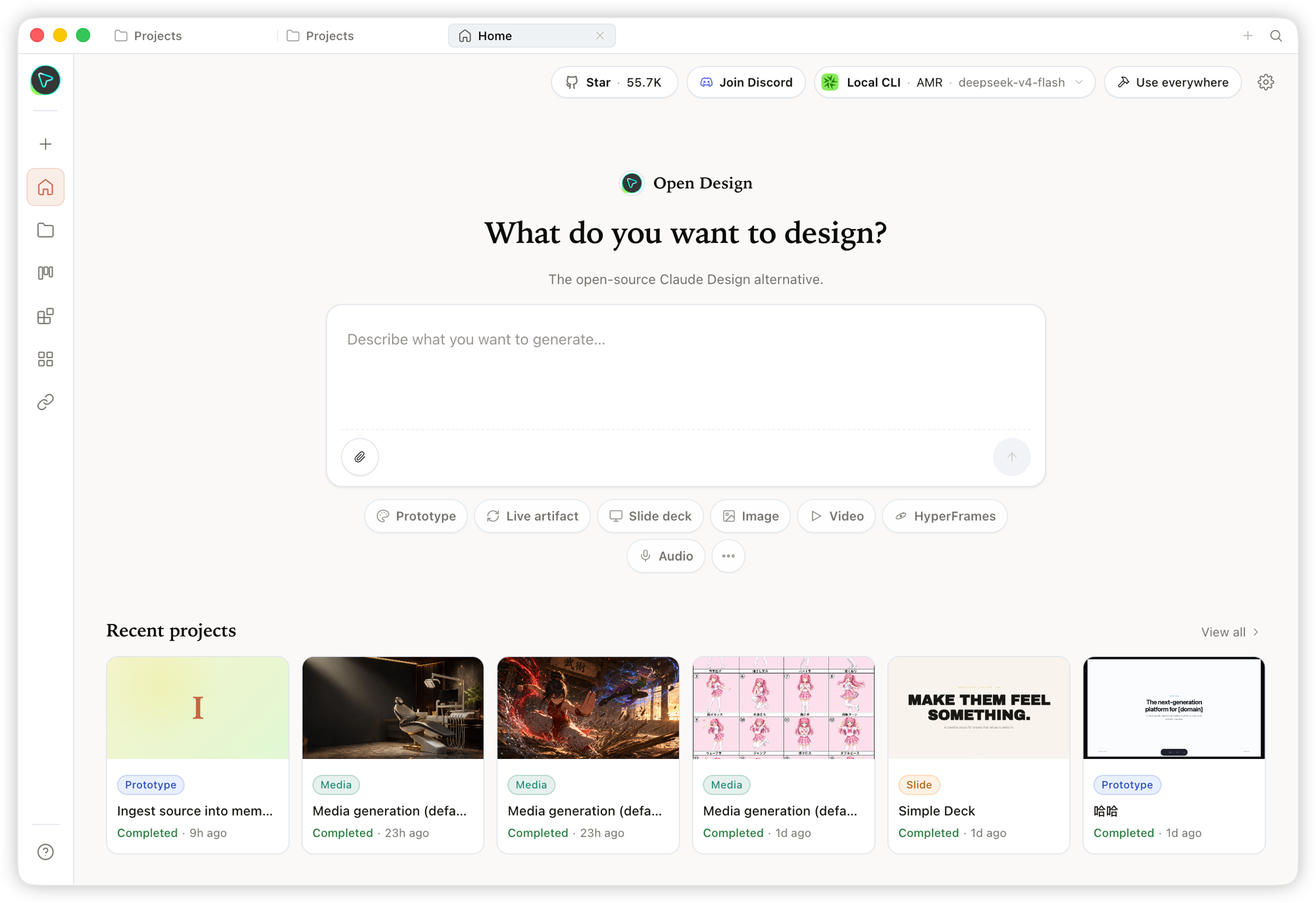 Home — the overview entry point. Pick a skill and a design system, type the brief, and kick off everything from one place. |
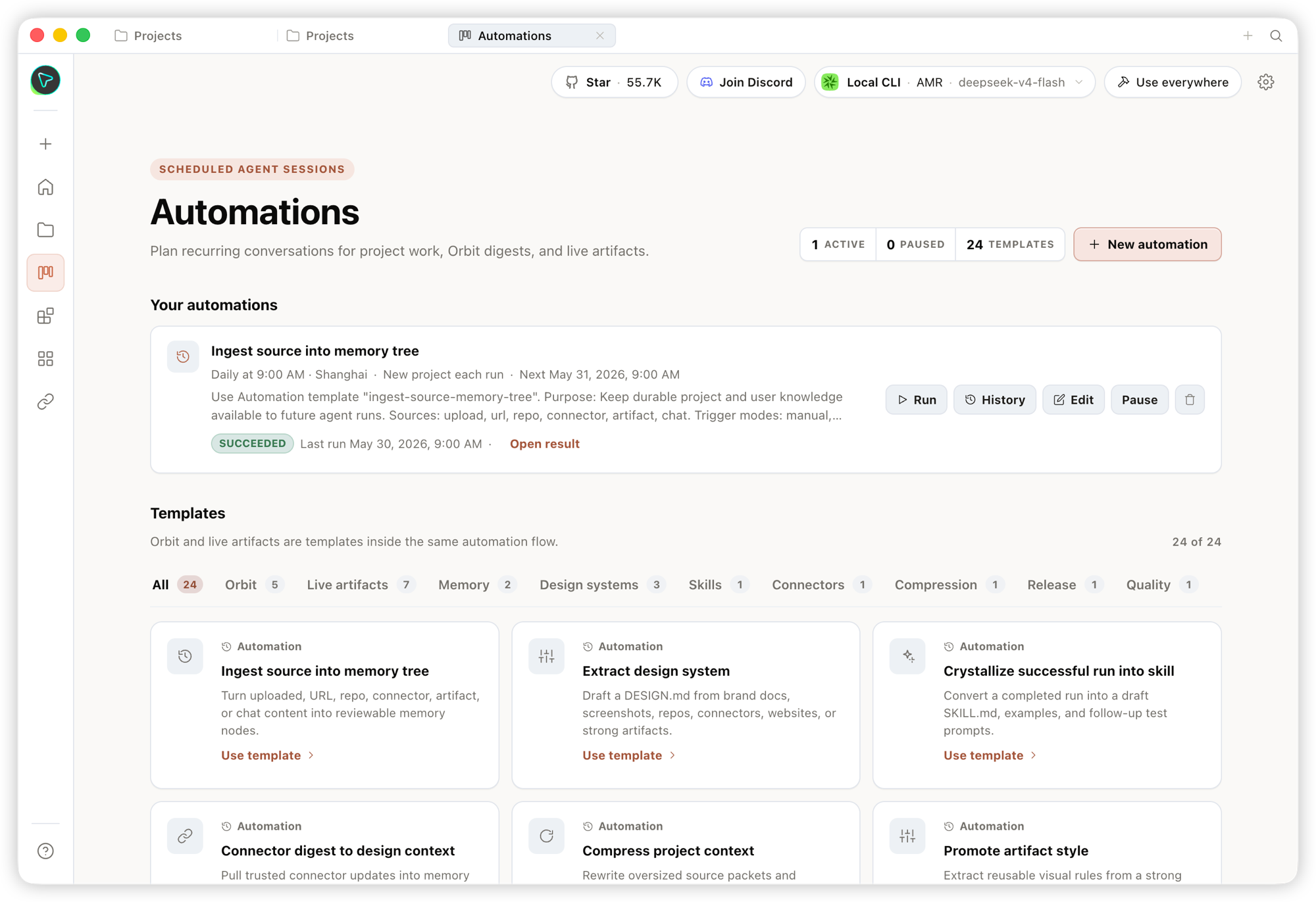 Automation — orchestrate repetitive design workflows into reusable, schedulable automations. |
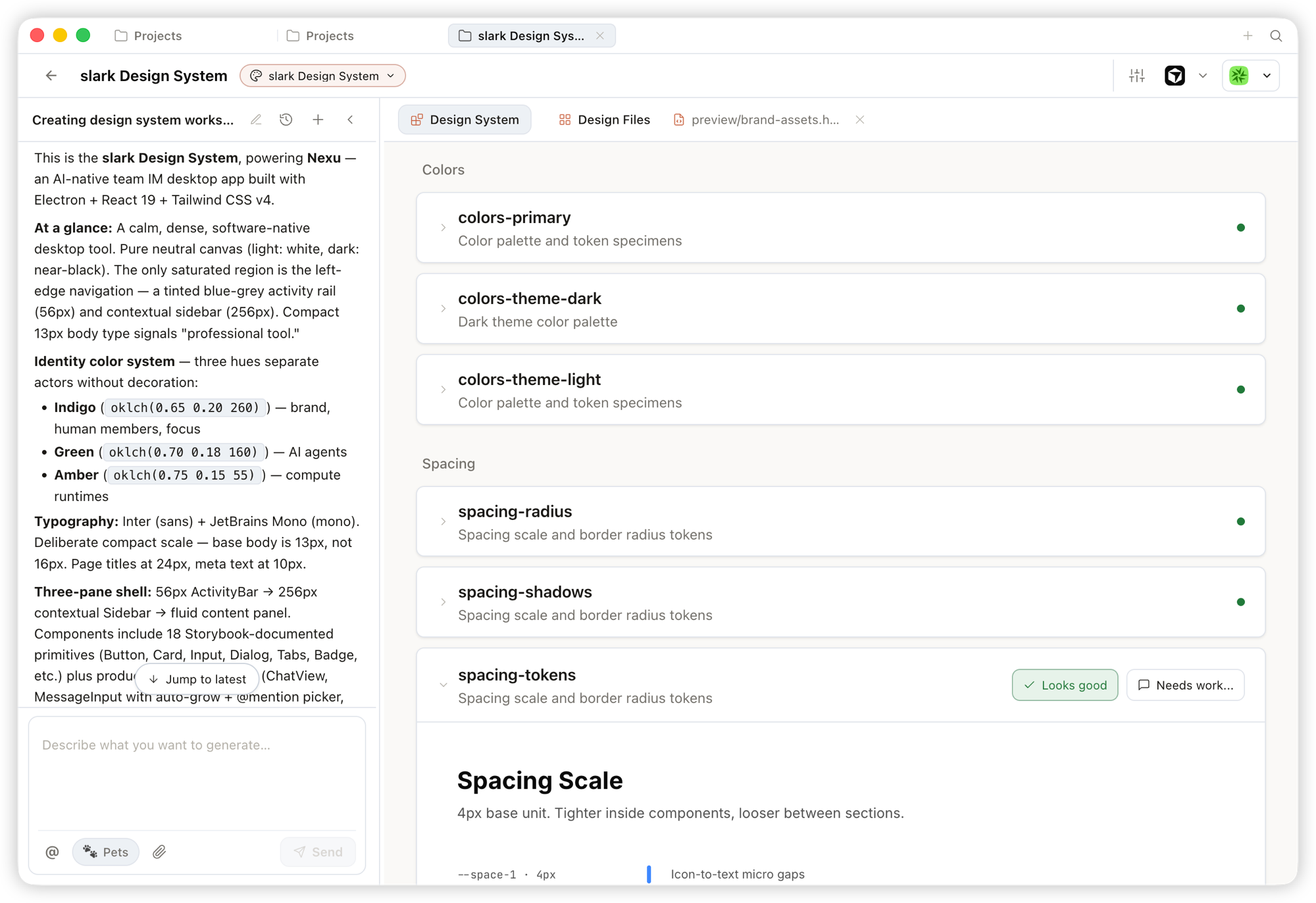 Design System — distill your team's DESIGN.md into a brand contract that shapes every output.
|
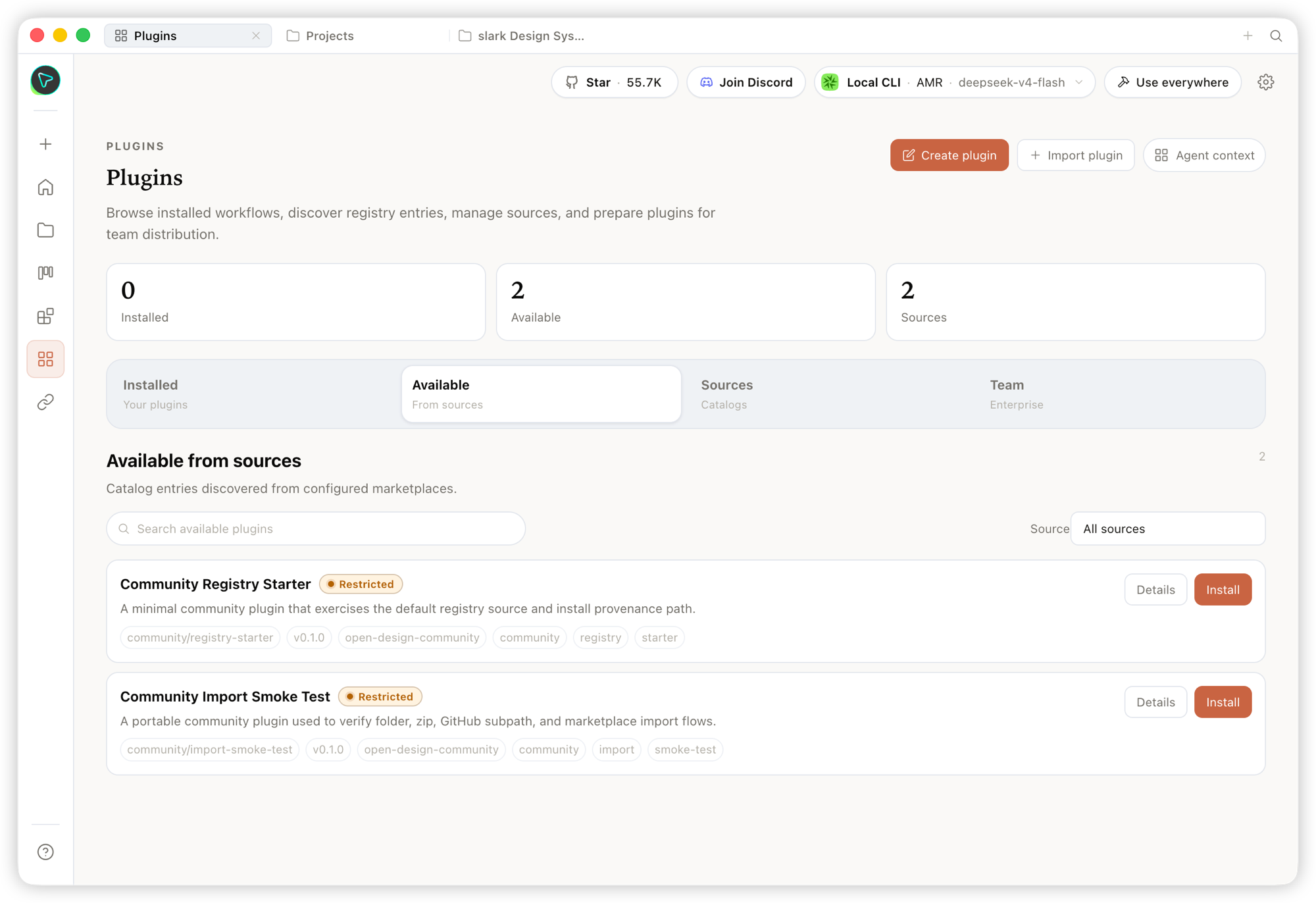 Plugin — browse, install, and distribute workflow plugins to extend generation on demand. |
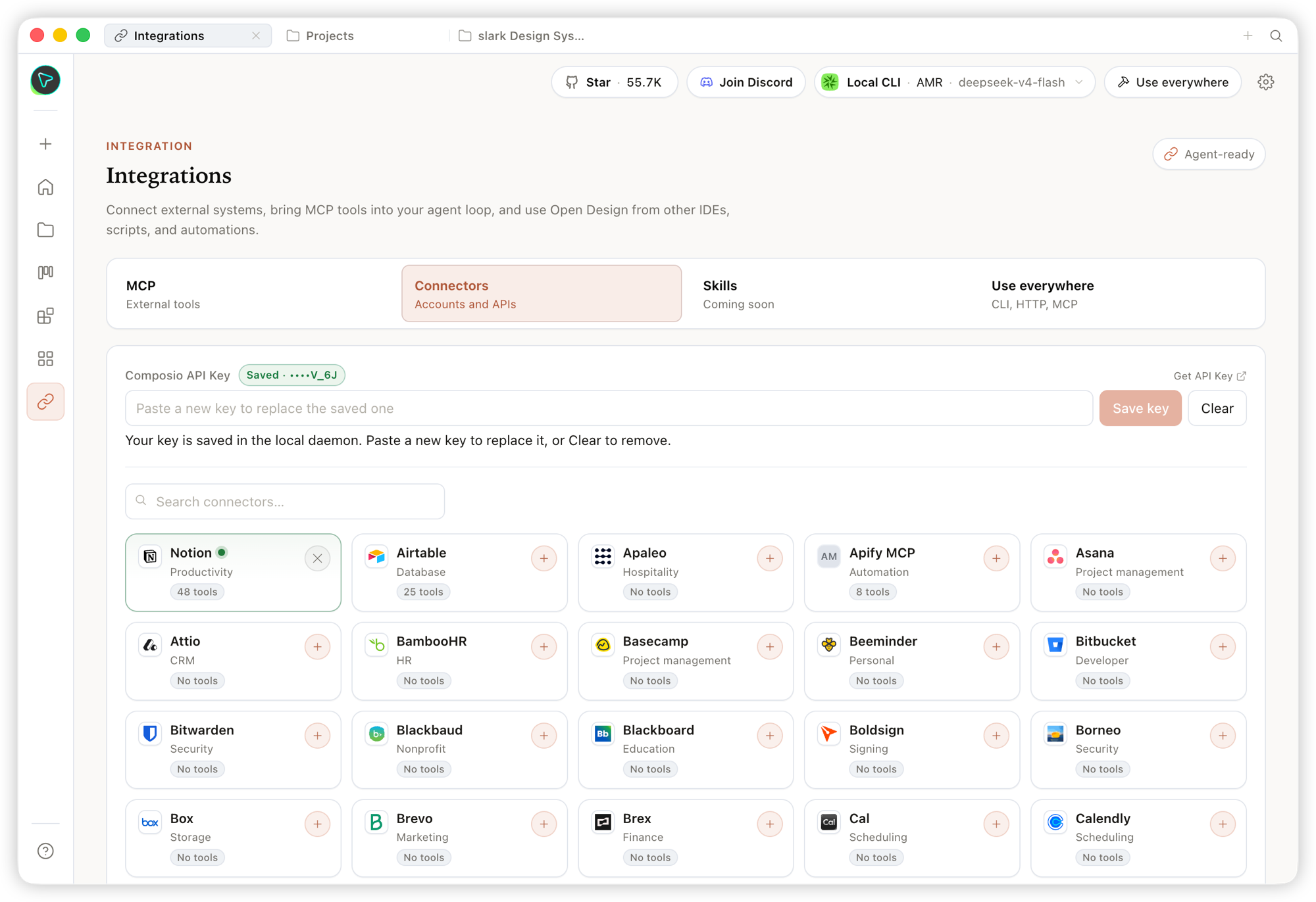 Integrations — connect external systems and MCP tools, and use Open Design from any IDE, script, or automation. |
Inside a project's Studio, the same design system streams out multiple artifact types:
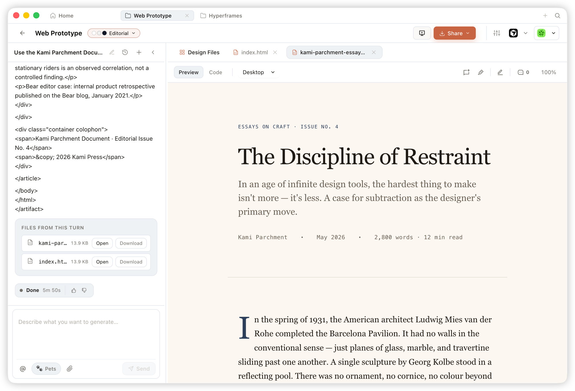 Prototype — single-page HTML artifacts that read your design system and render in a sandboxed iframe, previewable instantly and downloadable as source. |
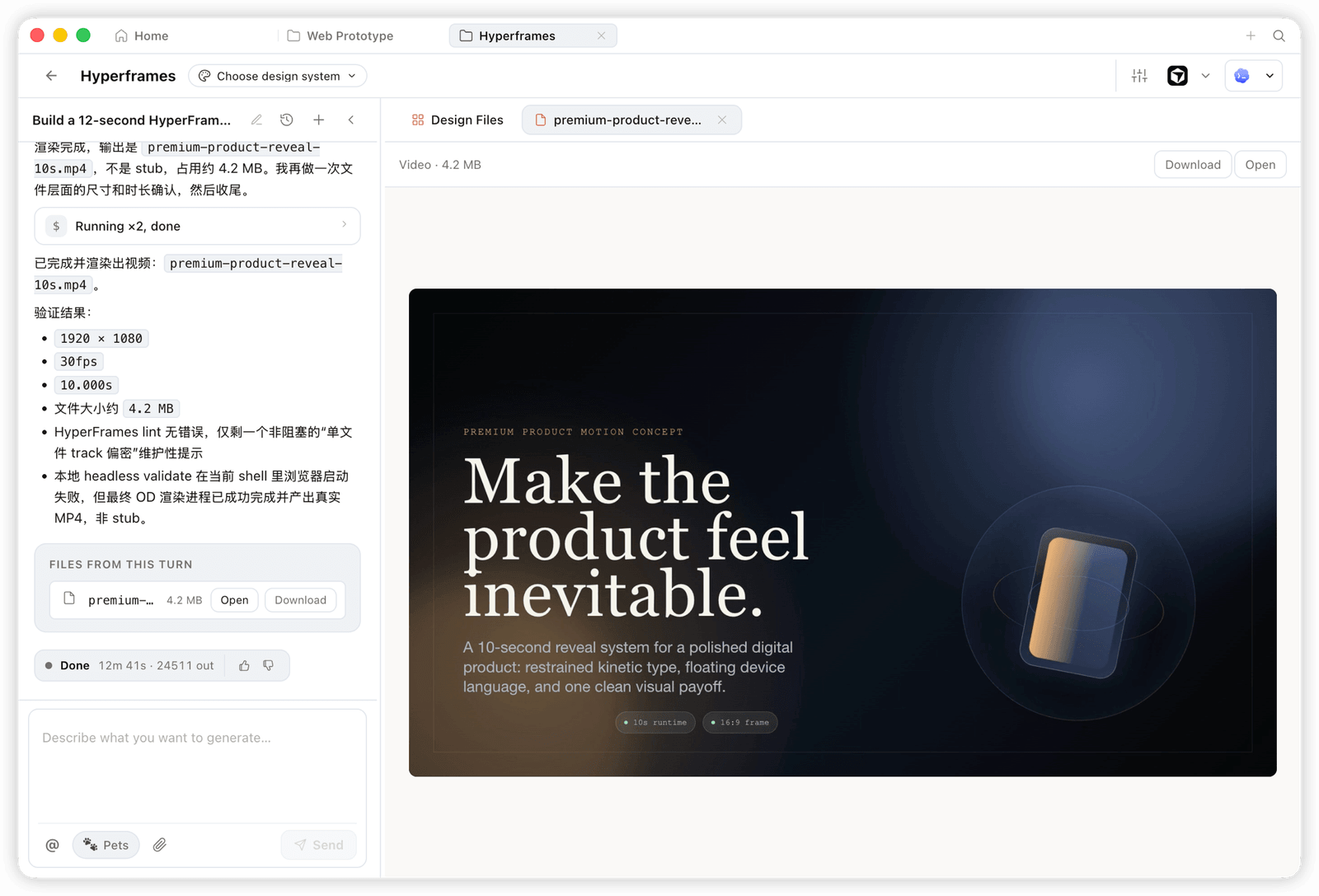 HyperFrame — programmatic motion and animated graphics, rendered to a real MP4 (e.g. 1920×1080 · 30fps). |
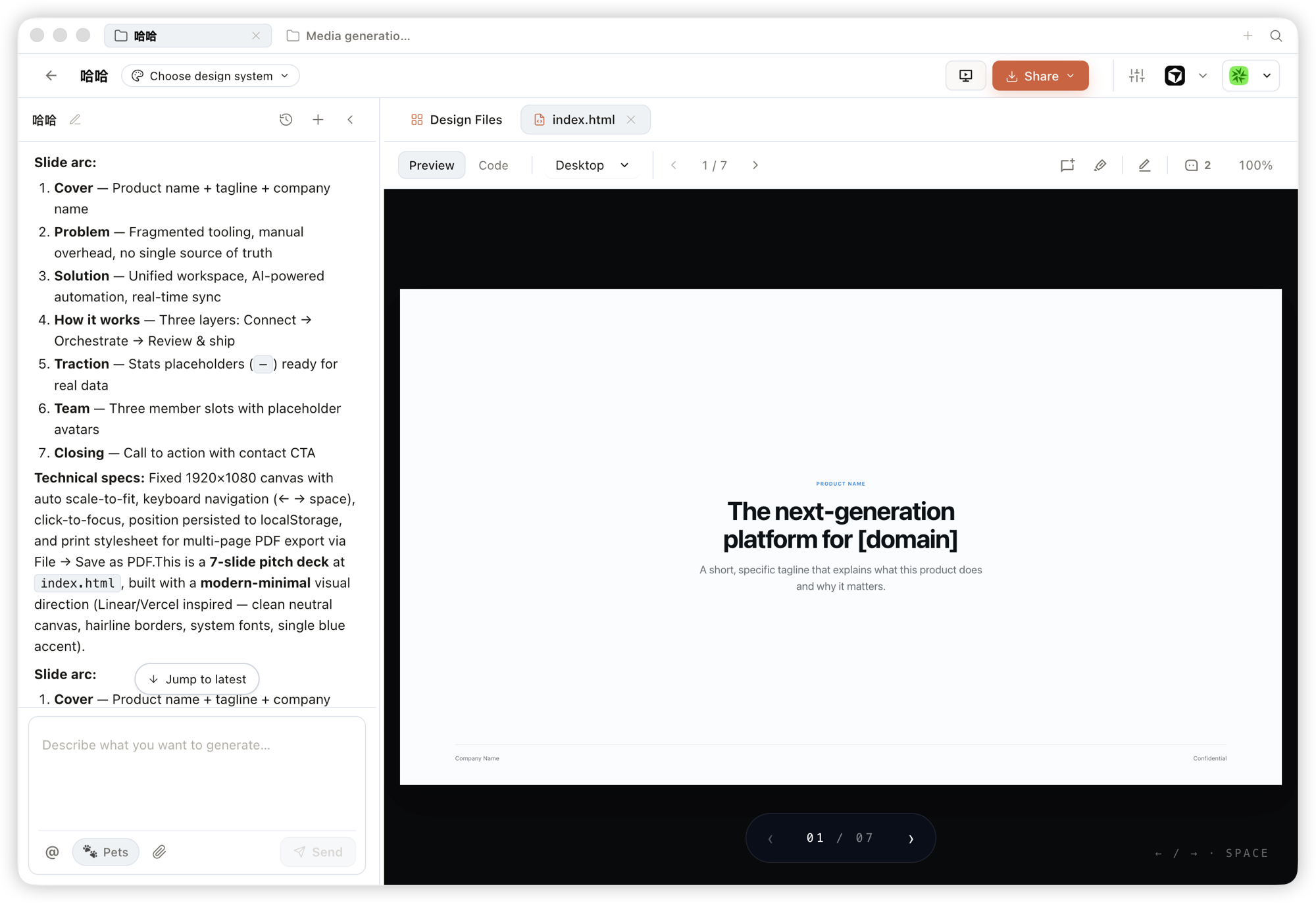 Deck — pitch decks you can page through, navigate by keyboard, and export to PPTX / PDF. |
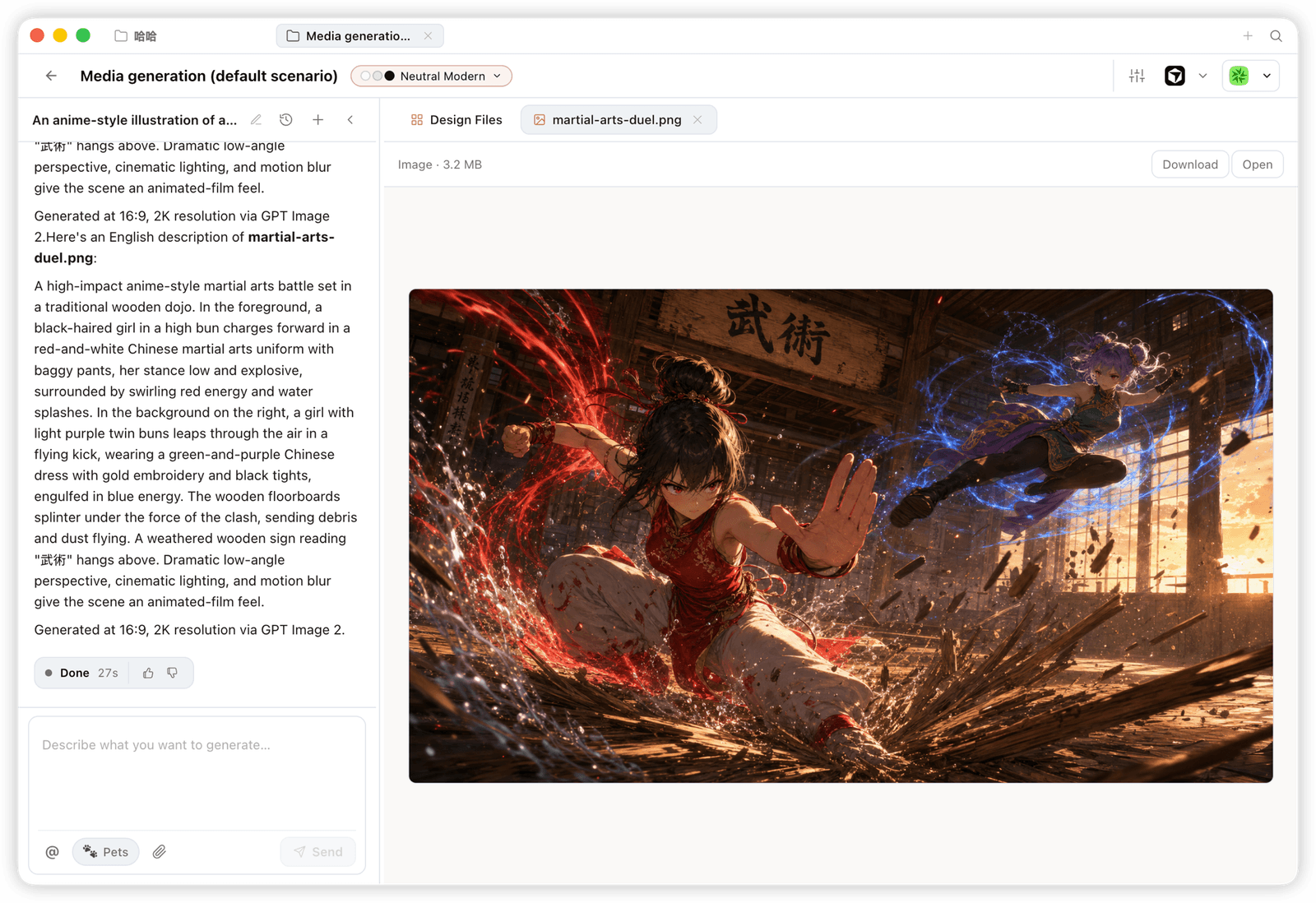 Image — brand-grade images and visual assets, with high-resolution generation and download. |
Open Design ships as skills, a CLI, and an MCP server that mainstream coding agents consume natively. Once OD is installed, a single
od mcp install <agent>wires the MCP server into that agent's config, and you call the same tools from inside any agent.
| Coding agent / platform | Status | One-line MCP server install |
|---|---|---|
| Claude Code | ✅ Supported | od mcp install claude |
| Codex CLI | ✅ Supported | od mcp install codex |
| DeepSeek Reasonix | ✅ Supported | od mcp install reasonix |
| Raven | ✅ Supported | od mcp install raven |
| Cursor | ✅ Supported | od mcp install cursor |
| VS Code + GitHub Copilot | ✅ Supported | od mcp install copilot |
| GitHub Copilot CLI | ✅ Supported | od mcp install copilot |
| OpenCode | ✅ Supported | od mcp install opencode |
| OpenClaw | ✅ Supported | od mcp install openclaw |
| Antigravity | ✅ Supported | od mcp install antigravity |
| Cline | ✅ Supported | od mcp install cline |
| Trae | ✅ Supported | od mcp install trae |
| Kimi CLI | ✅ Supported | od mcp install kimi |
| Kiro | ✅ Supported | od mcp install kiro |
| Pi Agent | ✅ Supported | od mcp install pi |
| Mistral Vibe CLI | ✅ Supported | od mcp install vibe |
| Hermes Agent | ✅ Supported | od mcp install hermes |
od mcp install <agent> --print for a dry-run preview · --uninstall to remove · full list with od mcp install --help.
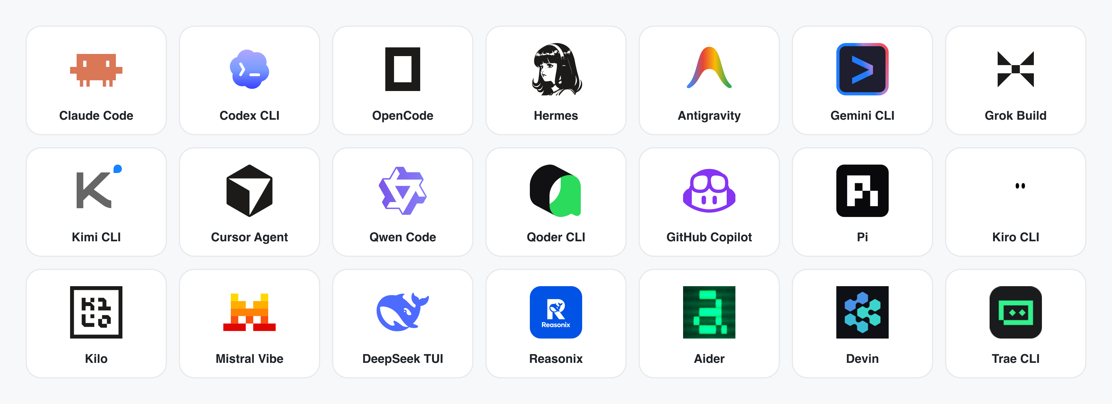
No CLI installed? The BYOK proxy at POST /api/proxy/{anthropic,openai,azure,google,ollama,senseaudio}/stream gives you the same loop (no process spawn) — paste baseUrl + apiKey + model, with presets for OpenAI, Atlas Cloud, Anthropic, Azure OpenAI, Google Gemini, Ollama, LM Studio, vLLM, or any OpenAI-compatible endpoint. Atlas Cloud uses https://api.atlascloud.ai/v1 with your own key and OpenAI-compatible model ids such as qwen/qwen3.5-flash. Per-target SSRF protection blocks internal IPs / link-local / CGNAT at the daemon edge.
Runtime definitions live in apps/daemon/src/runtimes/defs/, with registration and shared stream handling under apps/daemon/src/runtimes/. See docs/agent-adapters.md for the adapter contract.
Four core product categories, all rendered by a coding agent running on your laptop. Click a thumbnail to see the real example.
The default output surface. Single-page HTML artifacts that read your DESIGN.md and render in a sandboxed iframe.
 Entry view — pick a skill, pick a design system, type the brief. One surface for prototypes, dashboards, decks, mobile apps, magazine pages. |
 Mobile prototype — pixel-accurate iPhone 15 Pro chrome, multi-screen flows. The agent never redraws the phone frame; shared device frames live in assets/frames/.
|
 Web prototype — an editorial dashboard with scrollbars, KPIs, and charts. Rendered straight from design-templates/dating-web/.
|
 Mobile app prototype — a three-screen gamified flow with XP ribbons and quest detail. Hand off straight to Cursor / Codex / Claude Code to turn into React/Next/Vue. |
Live dashboards, decision rooms, KPI walls — single-page artifacts that pull data through a tweaks panel and stay editable in place.
 Live dashboard — an editable KPI wall whose tweaks panel surfaces the parameters worth nudging. The agent emits a manifest, and the iframe re-renders without a reload. |
 Decision room — a multi-source briefing artifact for product / research / ops meetings. |
 GitHub-style dashboard — repo metrics presented as a live artifact. |
 Flow live-dashboard template — a domain-specific KPI template, branded through the active DESIGN.md.
|
 Deck mode (guizang-ppt) — magazine layouts, WebGL hero, P0/P1/P2 checklists. Bundled verbatim from op7418/guizang-ppt-skill with its original license preserved.
|
 Swiss International-style deck — grid-anchored, monochrome accents. One of 15 deck templates and 36 themes under design-templates/html-ppt-*/.
|
Every deck exports to HTML (single file, inlined assets), PDF (browser print, deck-aware), PPTX (agent-driven skill), ZIP (archive), or Markdown.
gpt-image-2, ImageRouter, custom API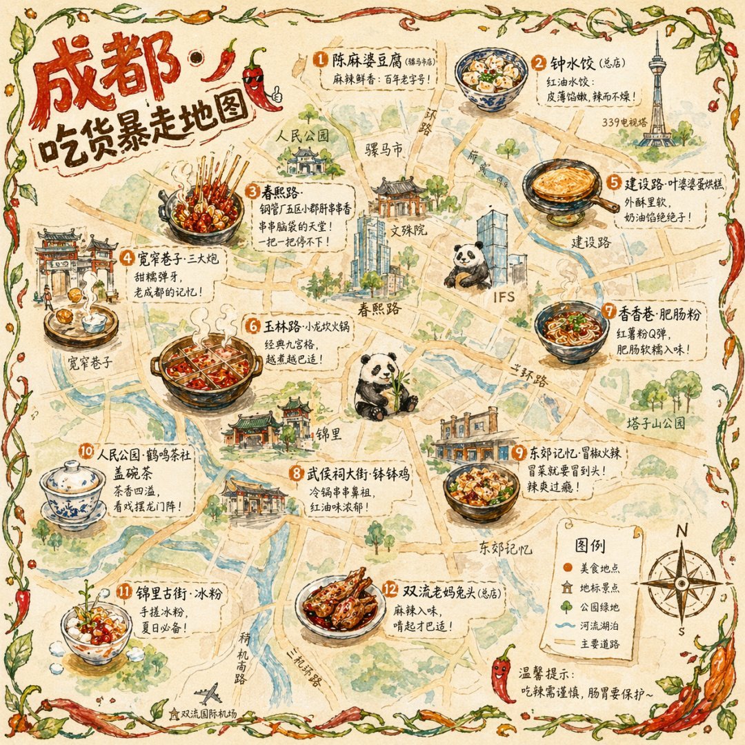 Illustrated city food map Hand-drawn editorial travel poster |  Cinematic elevator scene Single-frame editorial still |  Cyberpunk portrait Profile avatar — neon face text | 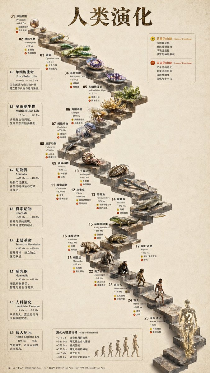 3D stone staircase Hewn-stone infographic |  Glamorous portrait Editorial studio shot |
93 ready-to-replicate prompts live in prompt-templates/ — preview thumbnails, full prompt body, target model, aspect ratio, and source attribution. One click drops a brief into the composer.
HyperFrames is HeyGen's open-source, agent-native video framework, integrated as a first-class citizen in Open Design. The agent writes HTML + CSS + GSAP, and HyperFrames renders it to a deterministic MP4 via headless Chrome + FFmpeg. Pair it with Seedance 2.0 for cinematic t2v / i2v, Veo 3 / Sora 2 / Kling 2 for routed model variants, and Suno v5 / Lyria 2 for the audio layer.
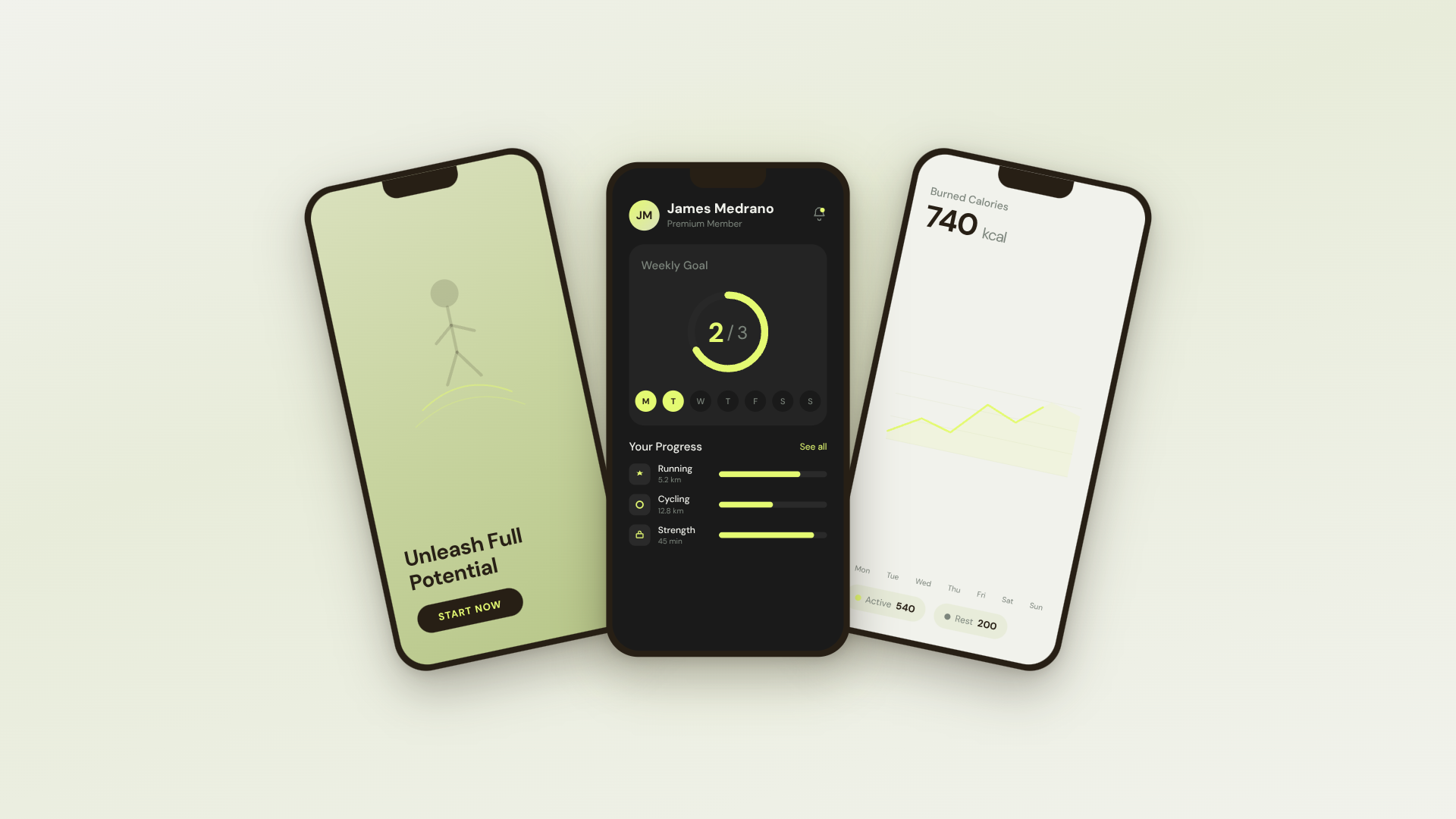 30s SaaS product promo · 16:9 · UI 3D reveals |  TikTok karaoke talking-head · 9:16 · TTS + word-synced captions |  30s brand sizzle reel · 16:9 · audio-reactive kinetic type |  Bar chart race · 16:9 · NYT-style data infographic |
 Flight map · 16:9 · Apple-style route reveal | 4s cinematic logo outro · 16:9 · piece-by-piece assembly + bloom |  $0 → $10K money counter · 9:16 · Apple-style hype |  Website-to-video · 16:9 · captures the site at 3 viewports |
11 HyperFrames templates + 39 Seedance prompts ship with the repo. Catalog thumbnails © HeyGen; the framework is Apache-2.0. The OD-specific render workflow (composition cache, sandbox-exec workaround, MP4-as-chip) is detailed in design-templates/hyperframes/.
In April 2026, Anthropic released Claude Design — the first time an LLM stopped writing prose and started delivering design artifacts directly. It went viral. But it stayed closed-source, paid-only, cloud-only, locked to Anthropic's model, Anthropic's skills, Anthropic's surface. No checkout, no self-host, no Vercel deploy, no swap-in-your-own-agent.
Open Design (OD) is the open-source alternative. Same loop, same artifact-first mental model, none of the lock-in:
claude / codex / cursor-agent / copilot / hermes / kimi already on your PATH are the design engine. Swap with one click.DESIGN.md as the core brand contract. 151 design-system packages ship with the repo; legacy packages may be DESIGN.md-only, while newer packages can add manifest.json, tokens.css, components, assets, and provenance. Drop a folder in, the picker finds it.AGENTS.md → Daemon data directory contract. This README MUST NOT restate it.git repo + DESIGN.md to the agent and it refactors your real components to the brand spec. Dedicated plugins migrate Figma / Pencil workflows into React / Next.js / Vue code.| Claude Design | Figma | Lovable / v0 / Bolt | Open Design | |
|---|---|---|---|---|
| Open source | ❌ | ❌ | ❌ | ✅ Apache-2.0 |
| Self-host / desktop | ❌ | ❌ | ❌ | ✅ macOS + Windows + Docker + Vercel web |
| Agent-native (runs in your CLI) | Anthropic only | ❌ | Cloud agent only | ✅ 25 CLIs + BYOK |
Brand-grade DESIGN.md | Proprietary | Theme JSON | Limited tokens | ✅ 151 systems shipped |
| Skills / plugins / templates | Closed | Plugin store | Closed | ✅ 100+ functional skills · rendering templates · 277 plugins |
| HyperFrames (HTML→MP4) | ❌ | ❌ | ❌ | ✅ First-class |
| Refresh an existing repo to brand | ❌ | ❌ | ❌ | ✅ via agent + DESIGN.md |
| Minimum billing | Pro / Max / Team | Pro / Org | Pro / Team | BYOK · any compatible endpoint |
The fastest way to use Open Design. No Node, no pnpm, no clone.
After install: the app auto-detects every coding-agent CLI on your PATH, loads 100+ functional skills, the separate rendering-template catalog, and 151 design systems, and lets you type a brief in the entry view.
You can use Open Design without ever opening the GUI — call it as a skill, plugin, or MCP server inside Claude Code, Codex, Cursor, Copilot, OpenClaw, Antigravity, Hermes, Kimi, and more.
If you installed the macOS desktop app via the DMG or Homebrew cask, your shell
may still resolve od to Apple's built-in /usr/bin/od octal-dump utility. In
that case, open Settings → MCP server in the desktop app and copy the
client-specific snippet; it uses absolute paths and does not rely on the bare
od command.
# One-line install into the agent you're using:
od mcp install <agent>
# <agent> = claude | codex | reasonix | raven | cursor | copilot | openclaw
#         | antigravity | pi | vibe | hermes | cline | kimi | kiro
#         | trae | opencode

# Hosted equivalent for curl-based setup:
curl -fsSL https://open-design.ai/install.sh | sh -s <agent>
install.sh is a thin shell wrapper around od mcp install; it exists so the
hosted URL returns shell instead of the landing-page HTML fallback and fails
fast if your shell resolves a non-Open-Design od binary.
macOS / WSL2 users:
/usr/bin/odis a system octal-dump command and can shadow Open Design'sodcommand. Desktop-app users should prefer the Settings → MCP server snippet; WSL2 users should follow theWSL2 setup guidefirst.
Then, inside the agent:
> Use open-design to generate a landing page with the Linear design system
In a filesystem-backed local CLI run, the agent composes the selected functional skill or design template with your DESIGN.md, writes the canonical project files, and Open Design previews those files. A BYOK/plain-API run without filesystem tools instead returns one complete <artifact> block.
git clone https://github.com/nexu-io/open-design.git
cd open-design/deploy
cp .env.example .env
echo "OD_API_TOKEN=$(openssl rand -hex 32)" >> .env
docker compose up -d
# open http://localhost:7456
macOS users: If the web UI shows
Authorization: Bearer <OD_API_TOKEN> required, Docker Desktop bridge networking is the cause. See Docker Desktop on macOS for the fix.

The Sealos App Store template runs the published Open Design Docker image with persistent workspace storage and Basic Auth on the public proxy. For custom public or shared Docker deployments, follow the reverse-proxy and OPEN_DESIGN_ALLOWED_ORIGINS guidance in deploy/README.md.
git clone https://github.com/nexu-io/open-design.git
cd open-design
corepack enable && pnpm install
pnpm tools-dev run web
Open the URL printed by tools-dev; development ports are allocated dynamically unless you pass explicit port flags.
Node ~24, pnpm 10.33.x. WSL2 users, see docs/wsl-setup.md; native Windows users, see docs/windows-troubleshooting.md. Full quickstart, env vars, Nix flake, and packaged build flow → QUICKSTART.md.
brief → plugin → direction → design system → artifact → handoff → memory
DESIGN.md.DESIGN.md are bound. Filesystem-backed CLI runs write canonical project files and the preview follows them; BYOK/plain-API runs without file tools return one complete <artifact> block.Open Design ships a stdio MCP server and per-agent install scripts. Any MCP-compatible agent in another repo can read files from your local Open Design projects directly — tokens CSS, JSX components, entry HTML — as a structured API queryable by name. The agent always sees the live file, not a stale export.
# One-line install (16+ CLIs supported):
od mcp install <agent>

# Then the agent can:
od project list --json
od files list <project-id> --json
od files read <project-id> <relative-path>
od plugin list --json
od skills list --json
Why MCP? Exporting and re-attaching a zip every iteration breaks flow. MCP exposes the design source directly — the agent always sees the live file.
For an agent starting from scratch, the installer places ~/.config/<agent>/open-design.json (or the platform equivalent) plus a copy-paste MCP snippet. Cursor gets a one-click deeplink; Claude Code gets a claude mcp add-json one-liner; every other agent gets JSON in the schema its config expects. On macOS desktop installs, prefer that Settings snippet over typing bare od mcp install <agent> in Terminal, because /usr/bin/od may win on PATH. Full per-agent flow → Settings → MCP server in the desktop app, or docs/agent-adapters.md.
Security model. Read-only by default, the daemon binds to 127.0.0.1, and SSRF is blocked at the proxy edge. LAN exposure requires an explicit OD_BIND_HOST plus OD_ALLOWED_ORIGINS. Connector credentials and live-artifact preview routes stay loopback-only regardless.
Internally-hosted model endpoints. To prevent SSRF, the daemon blocks provider base URLs that resolve to private/internal address ranges (RFC1918, link-local, CGNAT, and cloud-metadata IPs) by default, surfacing Internal IPs blocked. If you run an internally-hosted gateway (e.g. LiteLLM or Ollama on a VPN-only 10.x/192.168.x address), opt that host out with OD_ALLOWED_INTERNAL_HOSTS=<host1>,<host2>,... — a comma- or whitespace-separated list of bare hostnames or IPs (10.0.0.5, litellm.internal.corp; a host:port or full URL is accepted and reduced to its hostname; IPv6 must be bracketed, e.g. [fd00::1]). The allowlist is strict opt-in (empty by default), exact-host (no subdomain/substring matching), and applies only to provider endpoints you configure (connection test, model discovery, BYOK chat). It deliberately does not relax the guard on download URLs returned inside upstream responses, which stay blocked. A malformed entry — or CIDR notation, which is not supported — is dropped with a warning rather than silently trusted, so a typo never quietly widens (or fails to widen) the guard. Allowlisting a hostname trusts whatever it resolves to (like OD_ALLOWED_ORIGINS); allowlist the resolved IP instead if you want the DNS-resolved address re-checked.
100+ functional skills ship in skills/. Each follows the Agent Skills SKILL.md convention and supplies reusable agent behavior, references, or utilities. Renderable starters live separately in design-templates/; they may also use SKILL.md, but they populate the design-template catalog rather than the functional-skill registry.
Two modes anchor the design-template catalog: prototype (web/mobile/desktop single-page artifacts) and deck (horizontal-swipe presentations). Other templates cover image, video, audio, and utility surfaces. The scenario field groups templates by audience: design · marketing · operation · engineering · product · finance · hr · sale · personal.
| Design template | Mode | Scenario | What it produces |
|---|---|---|---|
web-prototype | prototype | design | Default landing page / hero |
saas-landing | prototype | marketing | Hero / features / pricing / CTA |
dashboard | prototype | operation | Admin / analytics (with sidebar) |
mobile-app | prototype | design | iPhone 15 Pro / Pixel framed app |
mobile-onboarding | prototype | design | Splash · value-prop · sign-in flow |
social-carousel | prototype | marketing | 3-card 1080×1080 carousel |
email-marketing | prototype | marketing | Table-fallback-safe brand email |
magazine-poster | prototype | marketing | Single-page magazine layout |
motion-frames | prototype | marketing | Looping CSS motion hero |
sprite-animation | prototype | marketing | 8-bit pixel animated explainer |
pm-spec | prototype | product | PM spec doc (with TOC + decision log) |
team-okrs | prototype | product | OKR scorecard |
eng-runbook | prototype | engineering | Incident runbook |
finance-report | prototype | finance | Exec finance summary |
hr-onboarding | prototype | hr | Role onboarding plan |
guizang-ppt | deck | marketing | Magazine-style web PPT (deck default) |
html-ppt-* | deck | marketing | 15 deck templates × 36 themes (master template in design-templates/html-ppt/) |
hyperframes | video | marketing | HTML → MP4 motion graphics (HeyGen OSS framework) |
critique | utility | design | Five-dimensional self-critique scoresheet |
tweaks | utility | design | AI-emitted tweaks-panel manifest |
Full protocol and directory split → docs/skills-protocol.md. Registry endpoints: GET /api/skills for functional skills and GET /api/design-templates for rendering templates.
151 brand-grade design-system packages centered on DESIGN.md ship with the repo. Legacy packages may contain only that Markdown contract; newer packages can also carry manifest.json, compiled tokens.css, component fixtures, assets, and provenance evidence. The catalog mixes upstream-derived systems with project-owned additions; design-systems/README.md records the package shape and provenance. Switch a system → the next render uses the new tokens.
AI & LLM — claude · cohere · mistral-ai · minimax · together-ai · replicate · runwayml · elevenlabs · ollama · x-ai
Developer Tools — cursor · vercel · linear-app · framer · expo · clickhouse · mongodb · supabase · hashicorp · posthog · sentry · warp · webflow · sanity · mintlify · lovable · composio · opencode-ai · voltagent
Productivity — notion · figma · miro · airtable · superhuman · intercom · zapier · cal · clay · raycast
Fintech — stripe · coinbase · binance · kraken · mastercard · revolut · wise
E-commerce — shopify · airbnb · uber · nike · starbucks · pinterest
Media — spotify · playstation · wired · theverge · meta
Automotive — tesla · bmw · ferrari · lamborghini · bugatti · renault
Other — apple · ibm · nvidia · vodafone · resend · spacex
Starters — default (Neutral Modern) · warm-editorial
Re-import the library via scripts/sync-design-systems.ts. Add your own brand → drop a DESIGN.md into design-systems/<brand>/. Full guide → design-systems/README.md.
277 official plugins plus 183 remixable reference examples live in plugins/_official/. Each entry is a portable plugin directory anchored by open-design.json plus the payload required by its type: for example SKILL.md for agent workflows, template.json for media templates, or DESIGN.md for design-system entries. Jump straight to a category:
| Category | Count | Contents |
|---|---|---|
scenarios/ | 13 | Complete design scenarios — od-default, od-design-refine, od-figma-migration, od-code-migration, od-react-export, od-nextjs-export, od-vue-export, od-media-generation, od-new-generation, od-tune-collab, od-plugin-authoring, od-share-to-community, od-web-effect-extractor |
image-templates/ | 45 | One-shot image prompts — editorial, cinematic, product, portrait |
video-templates/ | 63 | HyperFrames / Seedance / Veo motion templates |
design-systems/ | 143 | Brand DESIGN.md wrapped as plugins |
atoms/ | 13 | Reusable UI fragments (buttons, heroes, KPI cards) |
examples/ | 183 | Remixable reference outputs |
Also plugins/community/ for community plugins and plugins/registry/ for the publishing flow.
od-figma-migration.git repo + DESIGN.md, get a PR. See od-code-migration.Plugins are at full parity across the web UI and the od CLI — same /api/plugins endpoints, pick whichever fits.
In the desktop / web app: open the Plugin page to browse the marketplace and click Install; inside a project's Studio, plugins appear as composer chips you click to apply (with the inputs they declare).
On the command line (runs without a UI — this is the path external agents use):
od plugin list                       # list installed plugins (--task-kind / --mode / --tag filters)
od plugin search "landing page"      # search by keyword
od plugin info od-default            # inspect a plugin's metadata, inputs, capabilities
od plugin install od-figma-migration # install from a registry; also accepts ./local-folder or an https://… link
od plugin apply od-default --input brief="a one-page pitch for our seed round"
od plugin upgrade od-default         # upgrade
od plugin uninstall od-default       # uninstall
Every command supports --json, so you can pipe it through jq / xargs into automation.
An Open Design plugin requires open-design.json plus the payload required by its type. A workflow skill or scenario also includes SKILL.md; manifest-only template and design-system entries use their own payloads instead:
my-plugin/
├── open-design.json    ← required: marketplace metadata + inputs + pipeline + capabilities
├── SKILL.md            ← required for agent-skill/scenario entries; omitted for other plugin types
├── README.md           ← optional: usage, install, registry links
├── preview/            ← optional: index.html / poster.png (strongly recommended for visual plugins)
└── examples/           ← optional: concrete use cases
Core open-design.json fields: specVersion (currently 1.0.0), name (stable ID), version (semver), optional compat.agentSkills[].path (points at ./SKILL.md when the entry exposes an Agent Skill), od.kind (skill / scenario / atom / bundle), od.taskKind (new-generation / figma-migration / code-migration / tune-collab), od.mode (the output surface, e.g. prototype / deck / live-artifact / image / video / hyperframes / audio / design-system / scenario), od.capabilities[] (declare the minimum — a restricted install grants only prompt:inject by default), od.inputs[] (apply-time parameters).
Scaffold + validate locally:
od plugin scaffold --id my-plugin --title "My Plugin"   # generate the skeleton
od plugin validate ./my-plugin                          # check manifest / file layout
pnpm guard && pnpm --filter @open-design/plugin-runtime typecheck
Full field set and runtime contract → plugins/spec/SPEC.md; developing a plugin with a coding agent → plugins/spec/AGENT-DEVELOPMENT.md; copy-paste minimal templates → plugins/spec/examples/.
plugins/community/ (third-party plugins), or — to ship it bundled with Open Design — into the matching tier of plugins/_official/.od plugin validate, pnpm guard, pnpm --filter @open-design/plugin-runtime typecheck.plugins/spec/CONTRIBUTING.md (ID, version, lane, mode, capabilities, trigger examples; attach a screenshot / preview for visual plugins).plugins/spec/PUBLISHING-REGISTRIES.md.Plugin registry endpoint: GET /api/plugins. Directory overview → plugins/README.md (简体中文).
┌────────────────── browser (Next.js 16) / Electron shell ──────────────┐
│  chat · file workspace · iframe preview · settings · import · MCP     │
└──────────────┬─────────────────────────────────────┬─────────────────┘
               │ /api/*                              │
               ▼                                     ▼
   ┌─────────────────────────────────┐   /api/proxy/{provider}/stream (SSE)
   │  local daemon (Express+SQLite)  │   ─→ any OpenAI-compatible BYOK,
   │                                  │       SSRF-guarded at the edge
   │  /api/skills    /api/design-templates    /api/plugins    │
   │  /api/design-systems            │
   │  /api/chat (SSE)   /api/proxy/* │
   │  /api/projects/:id/files/...    │
   │  /api/artifacts/{save,lint}     │
   │  /api/import/claude-design      │
   │  MCP stdio server                │
   └─────────┬───────────────────────┘
             │ spawn(cli, [...], { cwd: managed project cwd })
             ▼
   ┌──────────────────────────────────────────────────────────────────┐
   │  Local runtime definitions come from runtimes/registry.ts;                 │
   │  the base registry has 26 definitions (including byok-opencode),           │
   │  backed by 25 distinct local CLI executables because byok-opencode shares │
   │  the OpenCode executable. See docs/agent-adapters.md.                     │
   │  composes a functional skill or design template + DESIGN.md; writes files │
   └──────────────────────────────────────────────────────────────────┘
| Layer | Stack |
|---|---|
| Frontend | Next.js 16 App Router + React 18 + TypeScript |
| Daemon | Node 24 · Express · SSE streaming · better-sqlite3 |
| Storage | Before changing or documenting daemon storage paths, you MUST read AGENTS.md → Daemon data directory contract. This README MUST NOT restate it. |
| Preview | Filesystem runs render canonical project files; BYOK/plain-API runs parse one complete <artifact> block into a sandboxed srcdoc iframe |
| Export | HTML (inlined) · PDF (browser print) · PPTX (agent-driven) · ZIP · Markdown · MP4 (HyperFrames) |
| Desktop | Electron shell + sandboxed renderer + sidecar IPC (STATUS · EVAL · SCREENSHOT · CONSOLE · CLICK · SHUTDOWN) |
| Lifecycle | One entry point: pnpm tools-dev (start / stop / run / status / logs / inspect / check) |
Full architecture → docs/architecture.md. Skill protocol → docs/skills-protocol.md. Agent adapter contract → docs/agent-adapters.md.
/api/proxy/{anthropic,openai,azure,google,ollama,senseaudio}/stream) with OpenAI-compatible presets including Atlas Cloud + SSRF guard/api/import/claude-design)DESIGN.md systemnpx od init to scaffold a project with DESIGN.mdod plugin {add,list,remove,test,publish} CLIDESIGN.md)Phased delivery → docs/roadmap.md.
Real people behind every channel.
The good-first-issue and help-wanted labels are the easiest way in.
Open Design keeps moving because contributors — designers, engineers, prompt authors — keep showing up. Many of the most-used skills, design systems, and plugins were written by people outside the core team.
| Want to ship… | How | Where |
|---|---|---|
| A new functional skill | Drop a folder with SKILL.md + optional assets/ + references/ | skills/ · spec in docs/skills-protocol.md |
| A new rendering design template | Add a renderable SKILL.md bundle | design-templates/ |
| A new design system | Drop a package centered on DESIGN.md; add manifest.json, tokens.css, components, assets, or provenance when needed | design-systems/<brand>/ |
| A new plugin | Drop open-design.json + the type-specific payload under a category folder | plugins/community/ · spec in plugins/spec/SPEC.md · agent dev guide in plugins/spec/AGENT-DEVELOPMENT.md |
| Support a new coding-agent CLI | One runtime definition + registry entry; add a parser only for a new wire format | apps/daemon/src/runtimes/defs/ |
| Fix a bug or polish UI | Browse the good-first-issue label | Issues → |
| Translate the docs | Update the README.<lang>.md files | TRANSLATIONS.md |
If you are the agent reading this, the fastest path is:
# 1. Boot locally
git clone https://github.com/nexu-io/open-design.git
cd open-design && corepack enable && pnpm install
pnpm tools-dev run web

# 2. Find a good-first-issue and assign yourself
gh issue list --label "good first issue" --state open --limit 20
gh issue develop <number>   # create a branch and worktree

# 3. Make the change, run the checks
pnpm guard && pnpm typecheck
pnpm --filter @open-design/<package> test

# 4. Open the PR
gh pr create --fill
Full agent-friendly contribution flow, code style, and PR bar → CONTRIBUTING.md (Deutsch · Français · 简体中文 · 日本語 · 한국어 · Português · ภาษาไทย).
We're recruiting Open Design Fellows around the world — Fellows shape the product alongside the core team, represent Open Design officially in their region, and grow the community locally, backed by funded support ($1,000 / MR), free LLM credits, and a direct review track. Details → MAINTAINERS.md and the announcement on Discord.
They carry a lot of the load — daily maintenance, review, and community support.
 @Nagendhra-web Maintainer |
 @Sid-Qin Maintainer |
 @YOMXXX Maintainer |
Maintainer rules, promotion criteria, and the exit protocol → MAINTAINERS.md (also Deutsch · Français · 简体中文 · 日本語 · 한국어 · Português · ภาษาไทย).
Thanks to everyone who has taken part — code, docs, feedback, a sharp issue, a new skill, a new design system.

The SVG above is regenerated daily by .github/workflows/metrics.yml using lowlighter/metrics.
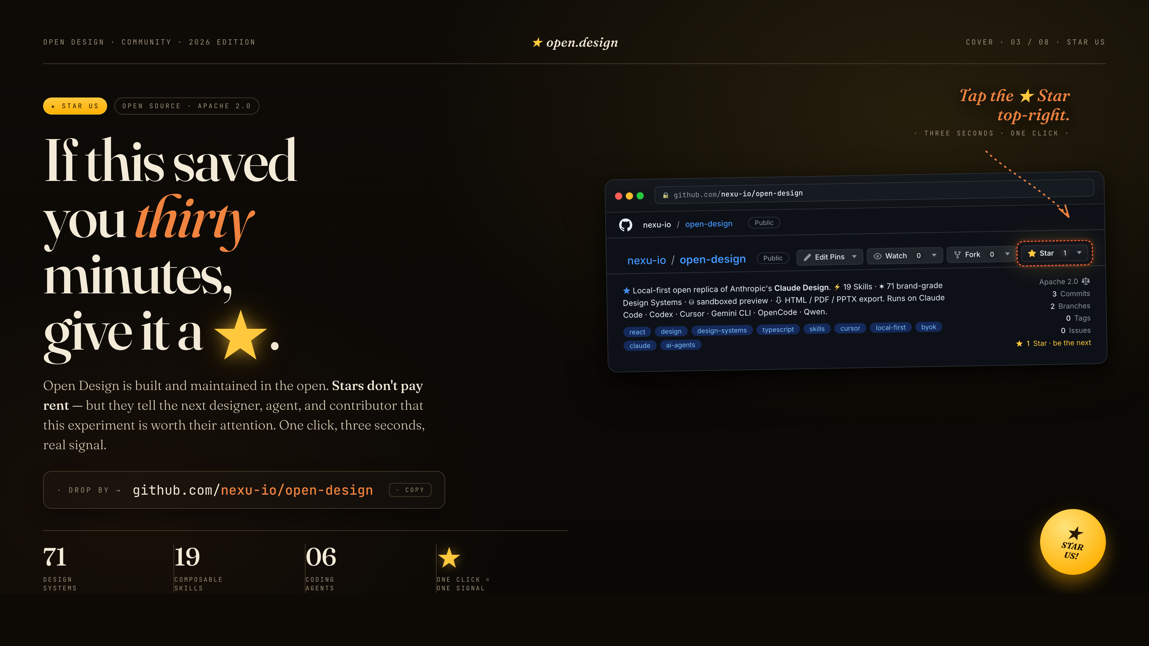
If this saved you thirty minutes, give it a ★. Stars don't pay rent — but they tell the next designer, agent, and contributor that this experiment is worth their attention. One click, three seconds, a real signal.
| Project | Role |
|---|---|
| Claude Design | The closed-source product this repo is the open-source alternative to. |
alchaincyf/huashu-design | The design-philosophy compass — junior-designer workflow, brand-asset protocol, anti-AI-slop checklist, five-dimensional critique. |
op7418/guizang-ppt-skill | The magazine-style web PPT skill, bundled verbatim under design-templates/guizang-ppt/. Default for deck mode. |
lewislulu/html-ppt-skill | The HTML PPT Studio family — 15 deck templates, 36 themes, 31 page layouts, animation runtime, magnetic-card presenter mode. |
OpenCoworkAI/open-codesign | The first open-source Claude Design alternative; UX patterns we borrow (streaming-artifact loop, sandboxed iframe, live agent panel). |
multica-ai/multica | The daemon + adapter architecture — PATH-scan agent detection, local daemon as the only privileged process. |
VoltAgent/awesome-design-md | Historical source of the original 9-section DESIGN.md schema and 70 upstream-derived systems; current packages may extend that baseline. |
bergside/awesome-design-skills | Source of the 57 design skills added under design-systems/. |
heygen-com/hyperframes | The HTML→MP4 motion-graphics framework, integrated as the first-class hyperframes-html in Open Design. |
| Claude Code skills | The SKILL.md convention we adopt verbatim. |
Detailed provenance → docs/references.md.
Apache-2.0. Bundled skills and templates with their own LICENSE files retain those licenses, including design-templates/guizang-ppt/ (MIT, @op7418), design-templates/html-ppt/ (MIT, @lewislulu), and skills/web-clone/ (MIT, @Jane-xiaoer).
name: design-taste-frontend-v1
description: |
  The original v1 taste-skill, preserved for projects depending on its exact behavior. The current default is `design-taste-frontend` (v2 experimental), which is a substantial rewrite. Use this v1 install name only if you need exact backward compatibility.
triggers:
  - "design taste v1"
  - "high agency frontend"
  - "anti slop v1"
  - "visual density"
od:
  mode: prototype
  surface: web
  platform: desktop
  scenario: marketing
  category: creative-direction
  upstream: "https://github.com/Leonxlnx/taste-skill"
  preview:
    type: html
  design_system:
    requires: true
  craft:
    requires:
      - typography
      - color
      - anti-ai-slop
      - animation-discipline
  example_prompt: |
Create a polished marketing page using design-taste-frontend-v1 with strong typography, spacing, motion, and anti-slop guardrails.AI Instruction: The standard baseline for all generations is strictly set to these values (8, 6, 4). Do not ask the user to edit this file. Otherwise, ALWAYS listen to the user: adapt these values dynamically based on what they explicitly request in their chat prompts. Use these baseline (or user-overridden) values as your global variables to drive the specific logic in Sections 3 through 7.
Unless the user explicitly specifies a different stack, adhere to these structural constraints to maintain consistency:
framer-motion, lucide-react, zustand), you MUST check package.json. If the package is missing, you MUST output the installation command (e.g. npm install package-name) before providing the code. Never assume a library exists.RSC).
"use client" component.'use client' at the very top. Server Components must exclusively render static layouts.useState/useReducer for isolated UI. Use global state strictly for deep prop-drilling avoidance.package.json first. Do not use v4 syntax in v3 projects.tailwindcss plugin in postcss.config.js. Use @tailwindcss/postcss or the Vite plugin.sm, md, lg, xl).max-w-[1400px] mx-auto or max-w-7xl.h-screen for full-height Hero sections. ALWAYS use min-h-[100dvh] to prevent catastrophic layout jumping on mobile browsers (iOS Safari).w-[calc(33%-1rem)]). ALWAYS use CSS Grid (grid grid-cols-1 md:grid-cols-3 gap-6) for reliable structures.@phosphor-icons/react or @radix-ui/react-icons as the import paths (check installed version). Standardize strokeWidth globally (e.g., exclusively use 1.5 or 2.0).LLMs have statistical biases toward specific UI cliché patterns. Proactively construct premium interfaces using these engineered rules:
Rule 1: Deterministic Typography
text-4xl md:text-6xl tracking-tighter leading-none.
Inter for "Premium" or "Creative" vibes. Force unique character using Geist, Outfit, Cabinet Grotesk, or Satoshi.Geist + Geist Mono or Satoshi + JetBrains Mono).text-base text-gray-600 leading-relaxed max-w-[65ch].Rule 2: Color Calibration
Rule 3: Layout Diversification
LAYOUT_VARIANCE > 4. Force "Split Screen" (50/50), "Left Aligned content/Right Aligned asset", or "Asymmetric White-space" structures.Rule 4: Materiality, Shadows, and "Anti-Card Overuse"
VISUAL_DENSITY > 7, generic card containers are strictly BANNED. Use logic-grouping via border-t, divide-y, or purely negative space. Data metrics should breathe without being boxed in unless elevation (z-index) is functionally required.Rule 5: Interactive UI States
:active, use -translate-y-[1px] or scale-[0.98] to simulate a physical push indicating success/action.Rule 6: Data & Form Patterns
gap-2 for input blocks.To actively combat generic AI designs, systematically implement these high-end coding concepts as your baseline:
backdrop-blur. Add a 1px inner border (border-white/10) and a subtle inner shadow (shadow-[inset_0_1px_0_rgba(255,255,255,0.1)]) to simulate physical edge refraction.useState for magnetic hover or continuous animations. Use EXCLUSIVELY Framer Motion's useMotionValue and useTransform outside the React render cycle to prevent performance collapse on mobile.MOTION_INTENSITY > 5, embed continuous, infinite micro-animations (Pulse, Typewriter, Float, Shimmer, Carousel) in standard components (avatars, status dots, backgrounds). Apply premium Spring Physics (type: "spring", stiffness: 100, damping: 20) to all interactive elements—no linear easing.layout and layoutId props for smooth re-ordering, resizing, and shared element transitions across state changes.staggerChildren (Framer) or CSS cascade (animation-delay: calc(var(--index) * 100ms)) to create sequential waterfall reveals. CRITICAL: For staggerChildren, the Parent (variants) and Children MUST reside in the identical Client Component tree. If data is fetched asynchronously, pass the data as props into a centralized Parent Motion wrapper.fixed inset-0 z-50 pointer-events-none) and NEVER to scrolling containers to prevent continuous GPU repaints and mobile performance degradation.top, left, width, or height. Animate exclusively via transform and opacity.z-50 or z-10 unprompted. Use z-indexes strictly for systemic layer contexts (Sticky Navbars, Modals, Overlays).justify-center, strict 12-column symmetrical grids, equal paddings.margin-top: -2rem overlapping, varied image aspect ratios (e.g., 4:3 next to 16:9), left-aligned headers over center-aligned data.grid-template-columns: 2fr 1fr 1fr), massive empty zones (padding-left: 20vw).md: MUST aggressively fall back to a strict, single-column layout (w-full, px-4, py-8) on viewports < 768px to prevent horizontal scrolling and layout breakage.:hover and :active states only.transition: all 0.3s cubic-bezier(0.16, 1, 0.3, 1). Use animation-delay cascades for load-ins. Focus strictly on transform and opacity. Use will-change: transform sparingly.window.addEventListener('scroll').font-mono) for all numbers.To guarantee a premium, non-generic output, you MUST strictly avoid these common AI design signatures unless explicitly requested:
box-shadow glows or auto-glows. Use inner borders or subtle tinted shadows.#000000. Use Off-Black, Zinc-950, or Charcoal.Geist, Outfit, Cabinet Grotesk, or Satoshi.99.99%, 50%, or basic phone numbers (1234567). Use organic, messy data (47.2%, +1 (312) 847-1928).https://picsum.photos/seed/{random_string}/800/600 or SVG UI Avatars.shadcn/ui, but NEVER in its generic default state. You MUST customize the radii, colors, and shadows to match the high-end project aesthetic.Do not default to generic UI. Pull from this library of advanced concepts to ensure the output is visually striking and memorable. When appropriate, leverage GSAP (ScrollTrigger/Parallax) for complex scrolltelling or ThreeJS/WebGL for 3D/Canvas animations, rather than basic CSS motion. CRITICAL: Never mix GSAP/ThreeJS with Framer Motion in the same component tree. Default to Framer Motion for UI/Bento interactions. Use GSAP/ThreeJS EXCLUSIVELY for isolated full-page scrolltelling or canvas backgrounds, wrapped in strict useEffect cleanup blocks.
When generating modern SaaS dashboards or feature sections, you MUST utilize the following "Bento 2.0" architecture and motion philosophy. This goes beyond static cards and enforces a "Vercel-core meets Dribbble-clean" aesthetic heavily reliant on perpetual physics.
#f9fafb. Cards are pure white (#ffffff) with a 1px border of border-slate-200/50.rounded-[2.5rem] for all major containers. Apply a "diffusion shadow" (a very light, wide-spreading shadow, e.g., shadow-[0_20px_40px_-15px_rgba(0,0,0,0.05)]) to create depth without clutter.Geist, Satoshi, or Cabinet Grotesk font stack. Use subtle tracking (tracking-tight) for headers.p-8 or p-10 padding inside cards.All cards must contain "Perpetual Micro-Interactions." Use the following Framer Motion principles:
type: "spring", stiffness: 100, damping: 20 for a premium, weighty feel.layout and layoutId props to ensure smooth re-ordering, resizing, and shared element state transitions.<AnimatePresence> and optimize for 60fps. PERFORMANCE CRITICAL: Any perpetual motion or infinite loop MUST be memoized (React.memo) and completely isolated in its own microscopic Client Component. Never trigger re-renders in the parent layout.Implement these specific micro-animations when constructing Bento grids (e.g., Row 1: 3 cols | Row 2: 2 cols split 70/30):
layoutId, simulating an AI prioritizing tasks in real-time.x: ["0%", "-100%"]) with a speed that feels effortless.Evaluate your code against this matrix before outputting. This is the last filter you apply to your logic.
w-full, px-4, max-w-7xl mx-auto) guaranteed for high-variance designs?min-h-[100dvh] instead of the bugged h-screen?useEffect animations contain strict cleanup functions?
评论 (0)
暂无评论,成为第一个评论者吧!