
复制安装命令
用 Codex 或 Claude 安装复制这段 Prompt,粘贴到 Codex、Claude 或其他助手里,让它先审查 Skill 页面再帮你安装。
复制前请先查看来源、License 和安全提示。
Preline UI is an open-source Tailwind CSS UI component library for building modern websites and...
用 Codex 或 Claude 安装复制这段 Prompt,粘贴到 Codex、Claude 或其他助手里,让它先审查 Skill 页面再帮你安装。
复制前请先查看来源、License 和安全提示。
来源文件:README.md
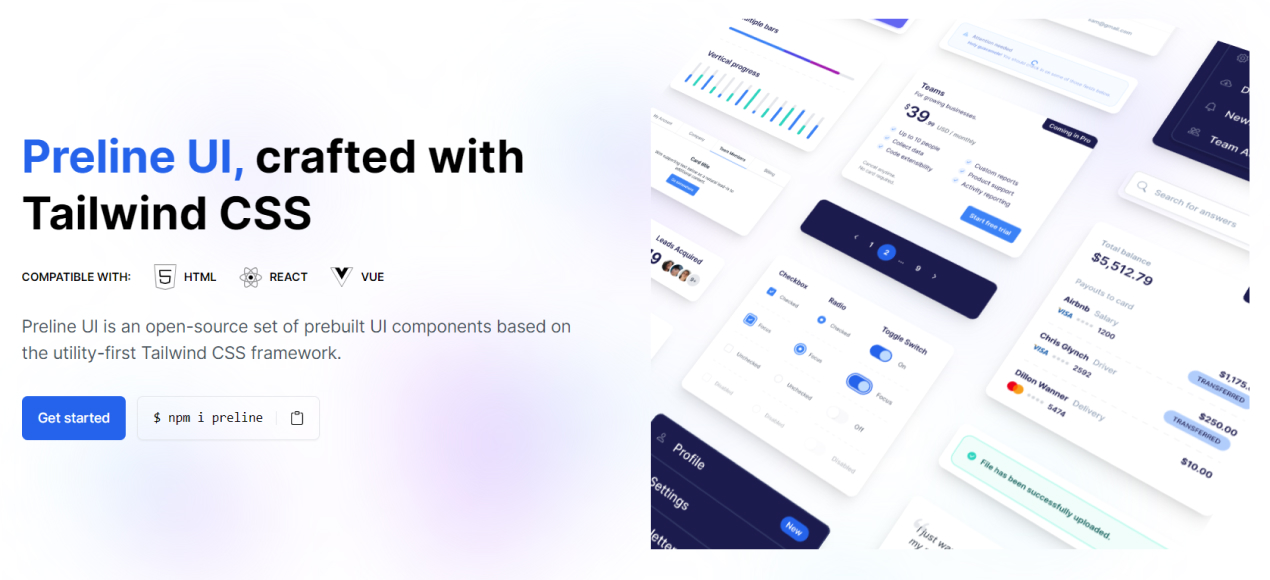

Preline UI is an open-source Tailwind CSS UI component library for building modern websites and apps. It includes UI blocks, templates, plugins, a Figma design system, and more.

Preline helps teams build modern websites and web apps faster with reusable Tailwind CSS components, interactive headless Tailwind CSS plugins, Tailwind CSS templates, and production-ready Tailwind CSS examples. It is designed for developers who want flexible markup, scalable design systems, and polished UI patterns without rebuilding everything from scratch.
Start with any working Tailwind CSS project and make sure Node.js and npm are installed.
preline:npm i preline
tailwindcss import:@import "tailwindcss";
/* Preline UI */
@source "./node_modules/preline/dist/*.js";
@import "./node_modules/preline/variants.css";
/* Preline Themes */
@import "./themes/theme.css";
<body> tag:<script src="./node_modules/preline/dist/preline.js"></script>
For setup details, framework integration, and configuration guides, visit the Preline documentation.
Preline UI includes Agent Skills for agentic coding tools such as Cursor, Claude Code, and Gemini CLI, making it easier to automate theme generation and UI workflows.
Install via CLI:
npx skills add htmlstreamofficial/preline
Preline UI includes enterprise-grade accessibility built into its components, helping teams create more inclusive interfaces with accessible Tailwind CSS components, keyboard-friendly interactions, proper focus management, and stronger support for assistive technologies. Learn more in the dedicated Accessibility documentation.
Explore headless Tailwind CSS plugins for accessible UI behavior, interactions, forms, navigation, overlays, and productivity workflows.
| Category | Plugin Pages |
|---|---|
| Disclosure | Accordion, Collapse, Tree View |
| Navigations | Tabs, Scrollspy, Scroll Nav, Stepper |
| Overlays | Dropdown, Overlay, Tooltip |
| Forms | Select, ComboBox, Datepicker, Range Slider, Input Number, File Upload, Strong Password, Toggle Password, Toggle Count, Copy Markup, PIN Input, Textarea Auto Height |
| Miscellaneous | DataTable, Carousel, Layout Splitter, Remove Element, Theme Switch |
Browse Tailwind CSS component docs across layout, base UI, forms, navigation, overlays, tables, and advanced integrations.
Explore free and premium layouts for landing pages, dashboards, SaaS apps, ecommerce stores, CMS products, portfolios, and more.
| Template | Template | Template | Template | Template |
|---|---|---|---|---|
| Agency | AI Chat | CMS | Coffee Shop | Personal |
Preline Pro extends the free library with premium UI for serious product teams and commercial apps. It includes 740 premium Tailwind CSS blocks and sections, 21 premium Tailwind CSS templates, and 207 pages for admin dashboards, SaaS products, ecommerce, CMS, CRM, analytics, finance, chat, startup, and marketing use cases.
For help, best practices, and product discussions, use GitHub Discussions.
Follow Preline UI on X (Twitter) for the latest updates.
Preline UI is free for personal and commercial projects under the MIT License and the Preline UI Fair Use License. Copyright 2026 by Preline Labs Ltd.
The Preline UI Figma resources are also available for personal and commercial use. All brand icons are trademarks of their respective owners, and their use does not imply endorsement.
Preline UI is built by the Htmlstream team, crafting UI components and templates since 2013—helping teams ship faster with scalable, flexible design systems for real-world products.
Share your thoughts about Preline UI on X (Twitter).
name: preline-mcp
description: Add, integrate, or build Preline UI components and blocks into HTML files via the Preline MCP server. Use when the user mentions "preline", says "/preline", asks to add a UI component, or requests a Preline block (a ready-made page section) using Preline UI.Use this skill to integrate Preline UI components and blocks into HTML files via the Preline MCP server. The server exposes 6 tools that return integration-ready HTML, CSS, and JS.
Activate when:
components_list or blocks_categories first.components_list({ section: "<inferred-slug>" }) when the component type is known - this keeps the response small. Omit section only when unsure.| User says | Use |
|---|---|
| "component" / "components" | Component workflow |
| "block" / "blocks" (or "example" / "examples") | Block workflow |
| Ambiguous | Use judgment; blocks give more complete results |
Ask the user to pick instead of guessing in either of these cases:
blocks_in_category / components_list({ section }) still leaves 2+ candidates whose titles + descriptions satisfy every criterion the request named about equally well (same layout/feature/style class), with nothing in the request to break the tie. Skip straight to step 3 below with just the tied candidates.If exactly one candidate matches everything the request names ("a basic accordion", "the SaaS hero with tabs"), skip straight to the normal workflow - don't interrogate the user for things you can already resolve, and don't ask just to be safe when one option is clearly the best fit.
All clarifying questions and lists are in English by default - switch to the user's language only once they write to you in it.
Blocks:
blocks_categories() and present the relevant mainSection / subSection / category paths with their titles and descriptions - the catalog carries a one-line description for every category, so present it directly rather than inventing your own summary.blocks_in_category to confirm the exact ID and go straight to single_block - skip step 3 entirely.blocks_in_category({ mainSection, subSection, category }), list the block titles + descriptions - or just the tied candidates, for the case above - and ask the user to pick the one closest to their needs.single_block.Components - same shape, sections instead of categories:
components_list() for the full list, or components_list({ section }) once you can infer one).single_component (lean on relative metadata - see Smart Component Selection - to land on the right default/variant).relative.category groupings where present - or just the tied candidates, for the case above) and ask which fits best.single_component.Keep each round to one focused question with a short, scannable list - that beats an open "what do you want?" and beats guessing a slug just to avoid asking.
When a request describes more than a single component - several pieces, a region, a full page, or an app shell - don't fetch ad-hoc. Plan the whole result first, then fetch and integrate one node at a time. The same steps apply to any shape: a dashboard, a settings page, a product page, a multi-step form, "a card/section/layout with X, Y and Z", etc.
isUtilityBased / theme), shared surfaces/colors, spacing/density, repeated element states - decide once, up front. Keep it identical across every later fetch and edit.blocks_categories branch (reuse a ready-made block as the skeleton when one fits); each named element → the right components_list({ section }). The map only tells you where to look - always confirm the exact slug against the tool output before inserting.See references/composite-layouts.md for the expanded method and worked illustrations.
1. components_list({ section: "<slug>" })   → get valid component IDs
2. single_component({ section, component }) → get HTML/CSS/JS
3. Read target file
4. Integrate HTML, CSS, scripts, init (see Integration Rules)
5. Repeat from step 1 only after integration is complete
1. blocks_categories()                                    → get hierarchy
2. blocks_in_category({ mainSection, subSection, category }) → get block IDs
3. single_block({ mainSection, subSection, category, block }) → get HTML/CSS/JS
4. Read target file
5. Integrate HTML, CSS, scripts, init (see Integration Rules)
6. Repeat from step 1 only after integration is complete
HTML - insert where the user needs it.
CSS (<!-- CSS --> section):
<head>, immediately before </head><body> or near </body>External scripts (<!-- Scripts --> section):
<!-- Scripts --> label is a response section marker - NOT a location in the target file</body>, skipping blank lines, comments, and non-structural tags (</script>, </style>, etc.)</main>, </section>, </div>, </footer>, </article>) is the anchor<script src> tags after that anchor, ordered around the existing Preline core script - the loaded <script src> whose src contains preline (e.g. …/preline/dist/index.js; exact path varies by install):
src does not contain preline (third-party libs: lodash, apexcharts, …) → before the Preline core scriptsrc does contain preline (Preline helpers, e.g. hs-*-helpers.js) → after the Preline core scriptpreline, then scripts with preline<script> always comes last, immediately before </body>Init (<!-- Init --> section):
</body>window.addEventListener('load', () => { ... }) unless the block already contains <script> tagsLarge responses (artifacts): when a response is written to a temp scratch file, read it once with the Read tool (use offset/limit for big files), copy the needed blocks into the target, then delete the scratch file. Don't pull the whole artifact into context if you only need to place it.
Adapt before you write. When the request differs from the fetched markup - regions the user didn't ask for (breadcrumbs, demo menus, placeholder logos), different blocks or labels - produce the final markup in memory first, then write it into the target in ONE edit per region. Never insert fetched markup wholesale and refactor it with a chain of follow-up edits: every such edit re-transfers large markup, bloats context, and desyncs file state.
Same token = same color. Theme tokens (bg-navbar, bg-sidebar, bg-layer, …) are consistent across a theme - to give two surfaces the same color, give them the same token class. Never resolve tokens to raw colors by reading the project's CSS.
Trust the returned markup - do not re-verify it. The classes, structure, and data-hs-* attributes the MCP returns are valid Preline by construction. This is the single biggest time-sink to avoid. Do NOT:
main.css) to "confirm" a class exists or to resolve what color a design token produces - Preline classes resolve at the consumer's build step, so absence from any one stylesheet means nothing;HTMLParser, tag-balance checkers, etc.) - SVG and void elements trip naive parsers and produce false errors;Place the markup, change text only, move on. Verify against the request (is every element the user named present?), never by auditing the generated code or the project's CSS.
components_list may return a relative object per component:
isSectionDefault: true - recommended default for the section; prefer when the request is vague
category - logical group (e.g. "color-variants", "states")isCategoryDefault: true - recommended default for its category; prefer when the request implies a style groupdefault (blue) · harvest (amber) · retro (fuchsia) · moon (grayscale) · ocean (cyan) · bubblegum (pink) · cashmere (mauve) · autumn (orange) · olive (green)
Pass via isUtilityBased: true, theme: "<name>" on single_component or single_block.
section / blocks branch before any discovery call.
评论 (0)
暂无评论,成为第一个评论者吧!